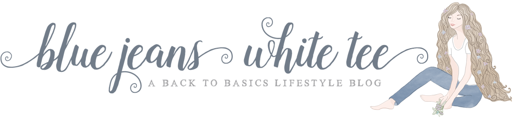

A few months ago I decided I was sick of using free blog graphics from around the web and I wanted a more profesh look on my little site. I’d seen a few examples of fellow blogger Kathy from Lace and Whimsy’s work and loved her vibe so I got in touch with her for some custom blog graphics.
I was after a total visual overhaul, wanting all of these bits:
- Blog header with an illustration
- Wreath frame for my sidebar photo
- Stylised “Start Here” button
- Illustrated category sidebar graphics
- An illustrated text divider
- A few backgrounds to overlay text over
We didn’t really put a timeframe on the project as it was such a big one, but being a hobby blogger I was in no rush and so Kathy fit my blog in whenever she could and we split the cost into stages over a good few weeks, which was a great way to break it up.
I wanted an illustration that reflected my blog name, Blue Jeans White Tee, along with a modern-day Lady Godiva/Rapunzel vibe for my header, what with my blog being mostly about my shampoo-free hair, and Kathy just got it straight away.
We had a brainstorm together where I sent over some images and ideas that captured the feel I wanted for the blog as a whole and from that Kathy put together a mood board, some colour palettes, font choices and doodles to start narrowing everything down.
Everything Kathy created I instantly fell in love with and I quickly picked fonts and colours and all that jazz until we got to the final version you see today.
For the photo wreath and “Start Here” buttons in my sidebar, I mentioned that poppies remind me of my late Nanny Penny while lavender and bees remind me of my late Nanny Bea, so Kathy used those as the basis of both.
I didn’t have to change a single thing when she sent her ideas over, I loved both the moment I saw them:
For the text divider I asked for something to do with hair that incorporated lavender. Kathy said she wasn’t sure on how they turned out, but honestly I loved them all and choosing just one was really difficult, aren’t they adorable? I went with number three by the way 🙂
Then came the graphics for the categories in my sidebar. All I had to do was make suggestions for some doodles and again, Kathy took it from there and nailed it, as you can see on the right further up the page…
One of my favourite touches was that I asked for a personalised journal for my Opinions category graphic along with one of my all-time favourite illustrations from Kathy’s Etsy Sticker Shop - seriously don’t you just want to nummy up those little deer?
Finally, Kathy created a ton of backgrounds for me and I use a mix of these and the elements from my category graphics to make the featured images you see around the site and on social media:
Kathy even sent me a handy style guide that helps me keep some consistency in the images I make myself:
What can I say? I finally have a cohesive theme across my entire website that really reflects what I’m all about and I couldn’t be happier with it.
It’s even going down well with fellow bloggers which is so lovely:
@kayleighconners @laceandwhimsy oh my god, I LOVE that! And I so rarely love blog designs these days. <3
— Aisling Brock (@aislingbrock) April 25, 2026
I couldn’t have told you what I wanted my blog to look like before all this. I guess I was thinking of something much more muted with lots of white space, but actually that wouldn’t have reflected me very well at all.
Kathy took all the images and ideas I was throwing around and found a way of creating something I couldn’t even articulate.
Basically Kathy saved me from my own lack of imagination.
Everything from the illustrated graphic elements to the fonts lets me put my own personality into my blog in a way that feels natural and true to myself, and I love that.
So, what I’m basically trying to say is, if you’re considering a blog redesign or any kind of custom graphic with a playful vibe, you’d be doing yourself a service by speaking to Kathy.
In fact I’m so pleased with what she’s done for my blog that I popped a wee credit to her work in my footer 🙂 thank you again, Kathy!

